

Color accuracy plays a crucial role in branding. You want your t shirts to reflect your brand identity. A consistent color scheme builds trust and recognition among consumers. Remember, color influences how customers perceive your brand. Achieving 98% accuracy in Pantone matching helps ensure your colors remain true across all materials.
Key Takeaways
- Color accuracy is essential for branding. It builds trust and recognition among consumers.
- Use Pantone color guides and conduct test prints to ensure your t-shirts match your brand colors accurately.
- Maintain consistency by using the same Pantone codes and standardizing materials across production.
Understanding Pantone Color Matching
What is the Pantone Color Matching System?
The Pantone Color Matching System (PMS) is a standardized color reproduction system. It allows designers and manufacturers to communicate colors accurately. Each color in the Pantone system has a unique code. This code helps ensure that everyone involved in the production process understands the exact shade you want.
Using Pantone colors simplifies the design process. You can avoid confusion over color names and descriptions. Instead, you refer to specific Pantone codes. This system is especially useful when creating t shirts. You want your t shirts to match your brand colors perfectly, and Pantone makes that possible.
Importance of Pantone in Branding
Color plays a vital role in branding. It influences how consumers perceive your brand. When you use consistent colors, you build trust and recognition. Pantone helps you achieve this consistency. Here are some reasons why Pantone is essential for branding:
- Brand Recognition: Consumers easily recognize brands by their colors. Think of iconic brands like Coca-Cola or Tiffany & Co. Their colors are instantly recognizable.
- Emotional Connection: Colors evoke emotions. For example, blue often represents trust, while red can signify excitement. Choosing the right Pantone colors can enhance your brand’s message.
- Quality Assurance: Using Pantone ensures that your colors remain consistent across different materials and production runs. This consistency is crucial for maintaining your brand’s image.
Color Models for T-Shirts: CMYK vs. RGB
Differences Between CMYK and RGB
When designing t shirts, understanding color models is essential. CMYK and RGB are two primary color models used in printing and digital design.
- CMYK stands for Cyan, Magenta, Yellow, and Key (Black). This model works by subtracting colors from white light. It is ideal for printing because it creates a wide range of colors by mixing these four inks.
- RGB stands for Red, Green, and Blue. This model uses light to create colors. It adds different intensities of red, green, and blue light to produce various colors. RGB is perfect for digital screens, as it relies on light rather than ink.
When to Use Each Color Model
Choosing the right color model depends on your project. Use CMYK when you print t shirts. This model ensures that the colors appear as intended on fabric. On the other hand, use RGB for digital designs. Websites and online marketing materials benefit from this model since screens display colors using light.
Tip: Always convert your RGB designs to CMYK before printing. This conversion helps avoid unexpected color shifts during the printing process.
By understanding these differences, you can make informed decisions about your t shirt designs. This knowledge will help you maintain brand consistency and achieve the desired look for your products.
Tools for Accurate T-Shirt Color Matching

Color Matching Tools Overview
To achieve accurate color matching for your t shirts, you need the right tools. Various tools can help you ensure that the colors you choose match your brand’s Pantone specifications. Here are some essential tools to consider:
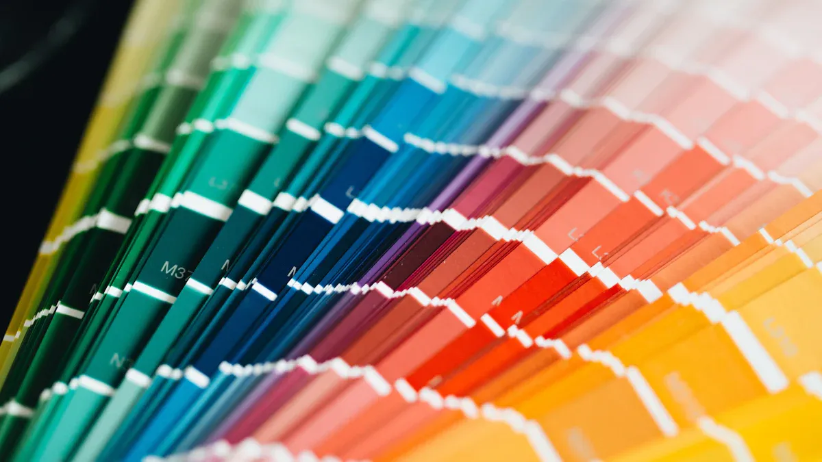
- Pantone Color Guides: These physical swatch books display a wide range of Pantone colors. You can use them to select and compare colors directly. They are invaluable for visualizing how colors will appear on fabric.
- Color Calibration Devices: These devices measure color accurately. They help you ensure that your printer or screen displays colors correctly. By calibrating your equipment, you can minimize discrepancies between digital designs and printed t shirts.
- Spectrophotometers: These advanced tools analyze the color of materials. They provide precise color readings, allowing you to match your t shirts to Pantone colors accurately. Spectrophotometers are especially useful for quality control during production.
- Color Matching Software: Many software programs can assist in color matching. They allow you to input Pantone codes and see how they translate to different materials. This software can help you visualize your designs before printing.
Techniques for Ensuring Accuracy
Using the right tools is just the beginning. You also need effective techniques to ensure color accuracy in your t shirts. Here are some strategies to consider:
- Create a Color Reference Library: Maintain a library of Pantone colors and their corresponding fabric samples. This library will serve as a reference point during the design and production process.
- Conduct Test Prints: Always perform test prints before finalizing your t shirts. This step allows you to see how colors appear on fabric. Adjust your designs based on the results to achieve the desired look.
- Monitor Lighting Conditions: Lighting can significantly affect how colors appear. Always evaluate colors under consistent lighting conditions. Natural daylight is often the best option for accurate color assessment.
- Collaborate with Your Printer: Communicate closely with your printing team. Share your Pantone specifications and any color samples. This collaboration helps ensure everyone is on the same page regarding color expectations.
- Document Your Process: Keep records of your color matching process. Note any adjustments made during testing and production. This documentation can help you refine your techniques for future projects.
By utilizing the right tools and techniques, you can achieve remarkable accuracy in your t shirt color matching. This accuracy will enhance your brand’s identity and ensure that your products resonate with consumers.
Common Challenges in T-Shirt Color Matching
Variability in Materials
When you create t shirts, the material can greatly affect color appearance. Different fabrics absorb and reflect light differently. For example, cotton tends to show colors more vibrantly than polyester. This variability can lead to unexpected results during production.
To overcome this challenge, always test your colors on the actual fabric you plan to use. This step helps you see how the Pantone colors translate to the specific material. Keep a sample library of different fabrics with their corresponding Pantone colors. This library will serve as a valuable reference during your design process.
Lighting Conditions and Their Effects
Lighting plays a crucial role in how colors appear. Natural light can make colors look different than artificial light. For instance, colors may appear warmer under incandescent bulbs and cooler under fluorescent lights.
To ensure accurate color matching, evaluate your t shirts under consistent lighting conditions. Use daylight or a color-corrected light source when assessing colors. This practice helps you avoid surprises when your t shirts are printed.
Tip: Always check your colors in the same lighting conditions you will use for production. This consistency will help you achieve the best results.
By being aware of these challenges, you can take steps to ensure your t shirts match your brand colors accurately.
Best Practices for T-Shirt Color Representation
Consistency Across Production
Achieving color consistency across production is vital for your brand. You want your t shirts to look the same, whether you print one or a thousand. Here are some best practices to ensure consistency:
- Use the Same Pantone Codes: Always refer to the same Pantone codes for your designs. This practice helps maintain uniformity across different batches.
- Standardize Your Materials: Choose specific fabrics and suppliers. Variations in materials can lead to color discrepancies.
- Train Your Team: Ensure everyone involved in the production process understands the importance of color accuracy. Provide training on using Pantone guides and color matching tools.
Tip: Create a color guide that outlines your brand colors and their Pantone codes. Distribute this guide to everyone involved in production.
Testing and Sampling Methods
Testing and sampling are essential steps in achieving accurate color representation. You should never skip these processes. Here are effective methods to consider:
- Conduct Color Tests: Always print samples before the final production run. This step allows you to see how colors appear on the actual fabric.
- Use Color Swatches: Compare your printed samples against Pantone swatches. This comparison helps you identify any color shifts.
- Gather Feedback: Involve team members in evaluating color samples. Different perspectives can help catch issues you might overlook.
Note: Keep a record of all tests and adjustments. This documentation will guide future projects and improve your color matching process.
By following these best practices, you can ensure that your t shirts consistently represent your brand colors. This consistency builds trust with your customers and strengthens your brand identity.
Accurate Pantone matching is crucial for your brand’s success. It ensures that your t shirts reflect your identity consistently. Implementing best practices will help you achieve this accuracy.
Remember, color accuracy builds trust and recognition with your customers. Prioritize it to strengthen your brand’s image!
Post time: Sep-22-2025